Boardgame Ecommerce Website
Overview
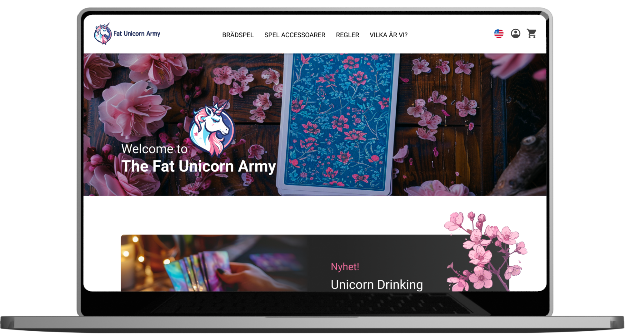
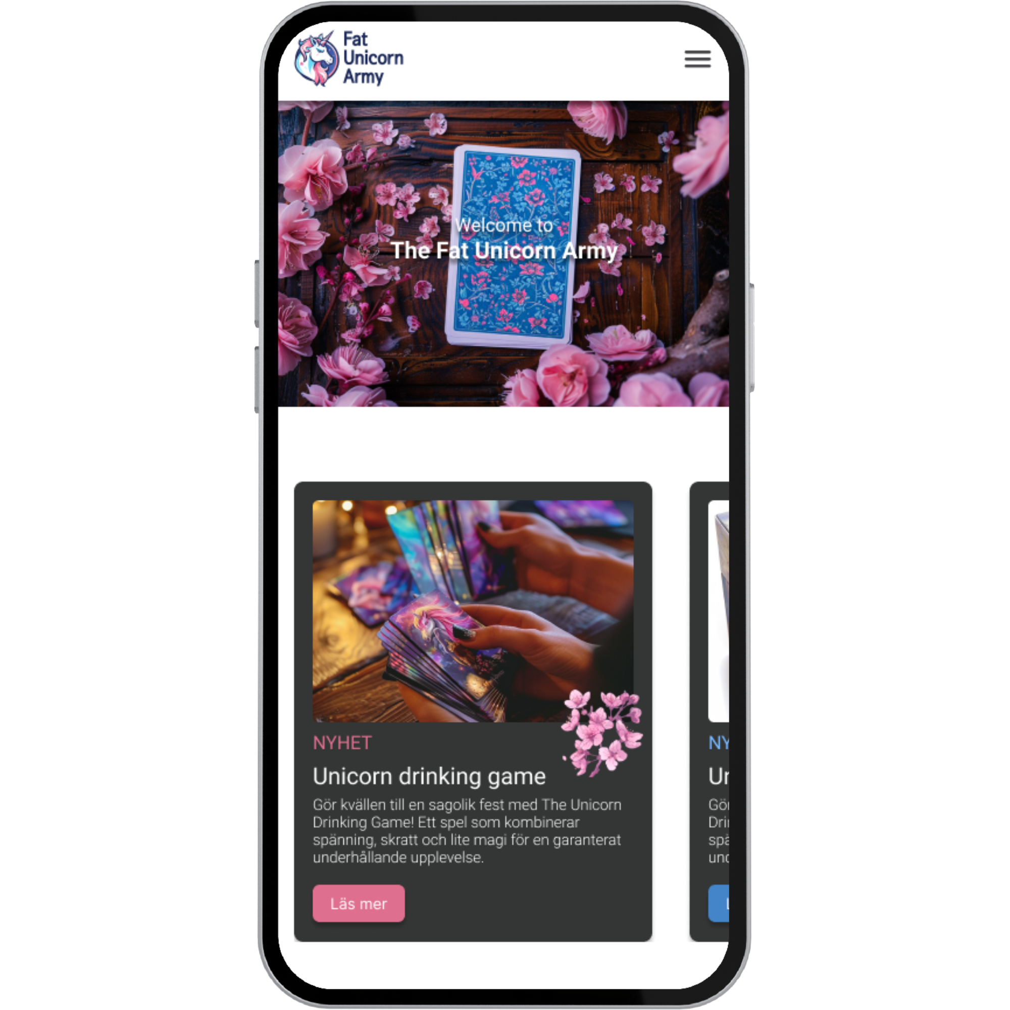
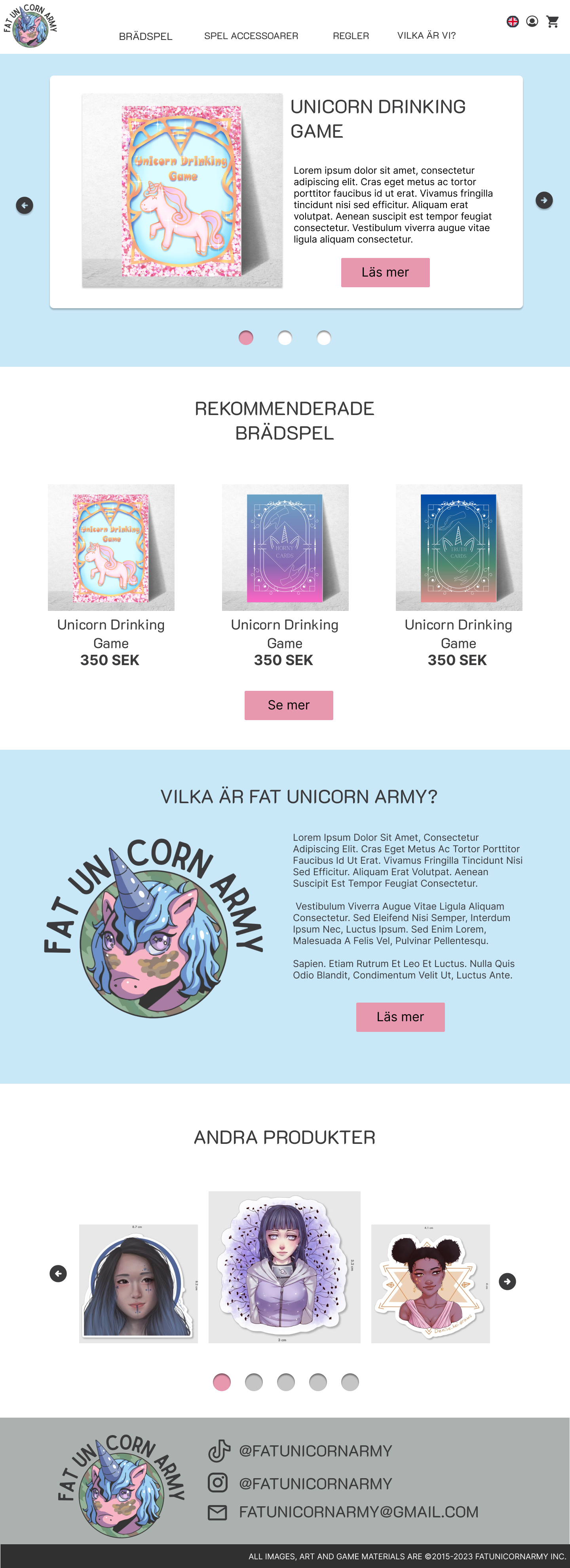
The goal of this project was to create a concept ecommerce website for my own future boardgame company called the fat Unicorn Army. A website that draws inspiration, keeps to the fantasy and pastel theme and is easy to navigate.
Time Frame: 5 weeks
My Role:
Planning
Conducting user research
Analysing data
Prototyping
Conducting user testing
Problem to solve
For this project, I combined a school assignment with my own dream to create something special—a concept ecommerce website for a boardgame company I've been wanting to start, themed around unicorns, fantasy, and pastel colors. The goal was clear: build an easy-to-use website that not only looks magical but feels inspiring to anyone who visits. This case study outlines how I turned this idea into a user-friendly prototype that stands out, reflecting the fun and enchantment of the games it's meant to sell.
Result
The final prototypes are a testament to a journey that included user research, learning from competitors, experimenting with various designs, and ultimately blending beautiful visuals and colors with a user-friendly navigation system - keeping to the standard layout. This process wasn't just about design; it introduced me to the exciting world of AI and the art of crafting prompts. This exploration was not only immensely enjoyable but also significantly enriched my understanding and skills.
Further down you can read more about how the Project was conducted and see more detailed mockups.
Planning
For this project, I used the design thinking approach. Here's a quick overview of the steps involved:
Empathize - This is about getting to really understand the people you're designing for, mainly through user research.
Define - Taking what you've learned from the research and making sense of it all.
Ideate - Using all that info to come up with a bunch of different ideas.
Prototype - Turning those ideas into actual designs.
Testing - Trying out those designs with users to see how they work.
This process isn't a straight line; it's more like a loop. Sometimes, you might realize you need more info about the users, so you go back to the empathize step. Or, if testing shows that your solution isn't quite right, you might need to rethink your ideas.
Before I started everything, I made a schedule for myself. Since I was on a tight timeline and working alone, planning my time was key. The plan did change a bit as I went along, but having an idea of how much time to spend on each part and sticking to deadlines I set was really helpful.
Empathize - User Research
Desktop Research - Checking out the playing field
Survey
Semi-structured Interviews
Competitor analysis in the form of UX review - Unstablegames.com and explodingkittens.com were examined
Summery of the User Research:
Survey
-
In order to gather quantitative data, I distributed a survey. The aim was to gain an understanding of users' perceptions regarding what makes a website user-friendly, their expectations, and what they consider most crucial when purchasing board games online. Additionally, I sought to uncover any features they believed could enhance their shopping experience.
-
27 replies, in the span of a week.
-
High-Quality Images & Information: Users emphasized the importance of having high-quality images and detailed information about the board games.
Simple Purchase Process: The buying process should be straightforward and user-friendly.
Responsive Website Design: It's crucial for the website to be responsive, as many users may browse for board games on their phones.
Access to Game Rules: There's a strong desire for the rules of the board games to be available on the website, and in various formats.
Semi-strutctured Interview
-
To delve deeper into qualitative insights and grasp the reasons behind user preferences, I conducted some semi-structured interviews. My interviewees were all enthusiasts of board games, with prior experience in purchasing them. The focus was to uncover what aspects make a board game website user-friendly and enjoyable to use.
-
Three
-
Quality and Quantity of Images: Interviewees stressed the significance of having both a high number of images and high-quality visuals for each board game, allowing them to fully understand what they are purchasing.
Detailed Game Information: There's a need for comprehensive details on what each game includes and its mechanics, enhancing the buying decision process. Furthermore, their was a desire for information with different lengths so that users either could get a broad overview or read a more detailed description.
Availability of Game Rules: Participants expressed a strong preference for having access to the rules of the board games on the website, making the website useful for more than just shopping.
Merchandise and Game Accessories: The idea of selling merchandise and game accessories alongside the games was well-received.
Website Navigation and Organization: The ease of navigating the website, along with clear categorization and flow, was highlighted as crucial for a positive user experience. Important to have a filter system.
Competitor Analysis/UX-Review
-
Since there was already serveral board game companies selling colorful and fantasy-themed board games, I decided to do a competitor analysis - in the form of a UX review. Using that method, I could both figure out what they did well and learn from that, but also avoid their mistakes. Since I also personally have an intrest in ethic UX-design, I also checked their websites for any dark patterns.
-
Unstablegames.com and Explodingkittens.com
-
After taking a deep dive into explodingkittens.com and unstablegames.com, I gathered some key insights that I could apply to my own themed board game e-commerce site.
Both sites nailed it with their easy-to-use navigation. It was a breeze to find and buy games.
Their filtering options were on point, making it super simple to find exactly what you're after without getting lost in the shuffle.
And let's talk visuals – they had some seriously eye-catching images that fit the game vibes perfectly.
The text was well-written and easy to digest, which is always a win in my book.
One thing I really appreciated was how they gave you quick game facts. It really helped to make informed decisions.
Overall, these sites gave me some solid inspiration for my own project. Time to take it up a notch!
Define
Personas
Impact map
Value proposition canvas
Flowchart
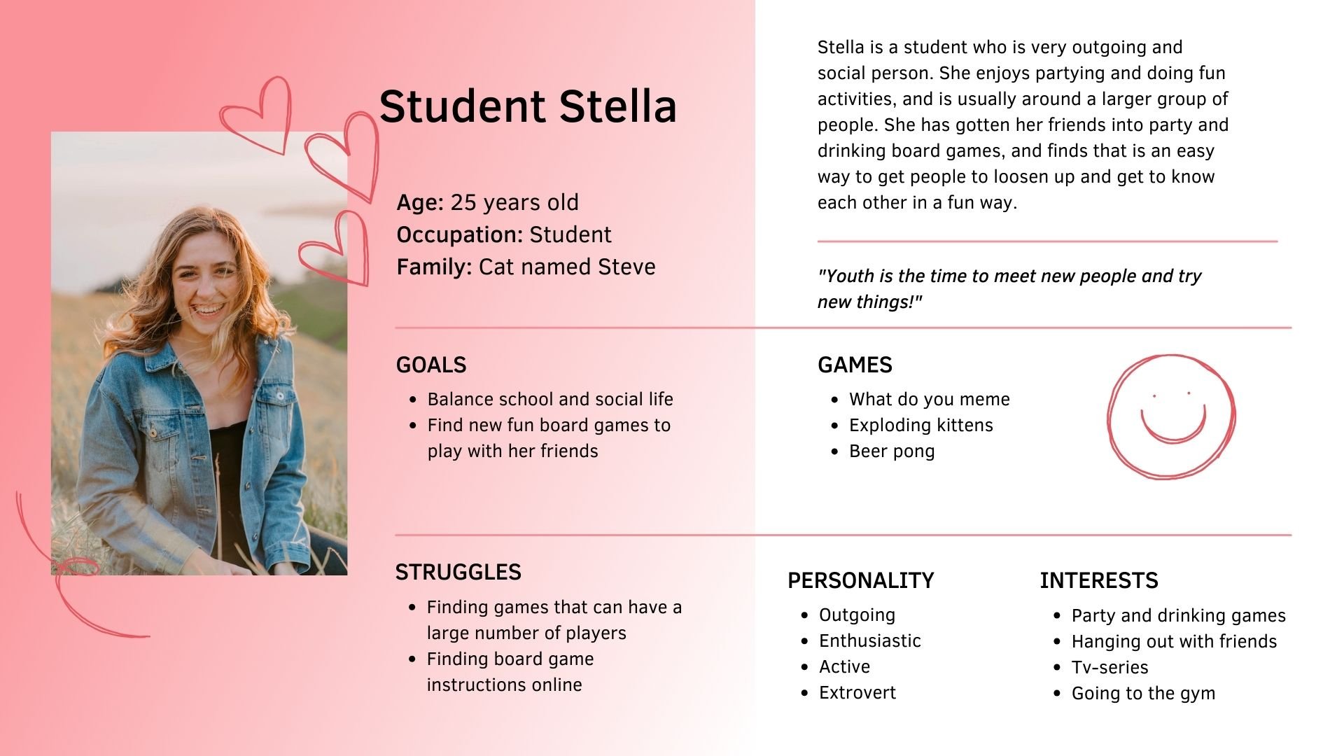
Personas
After looking through the user research, I created three different personas - who are all people intrested in boardgames and could be potential users of the website, but all have different goals and backrgounds.
Impact map
I created an impact map to outline the key features for different users. Given the tight timeline for the project, not all these features will make it into the website's first version. However, having this map helps in designing a site that can easily grow and include these features down the line.
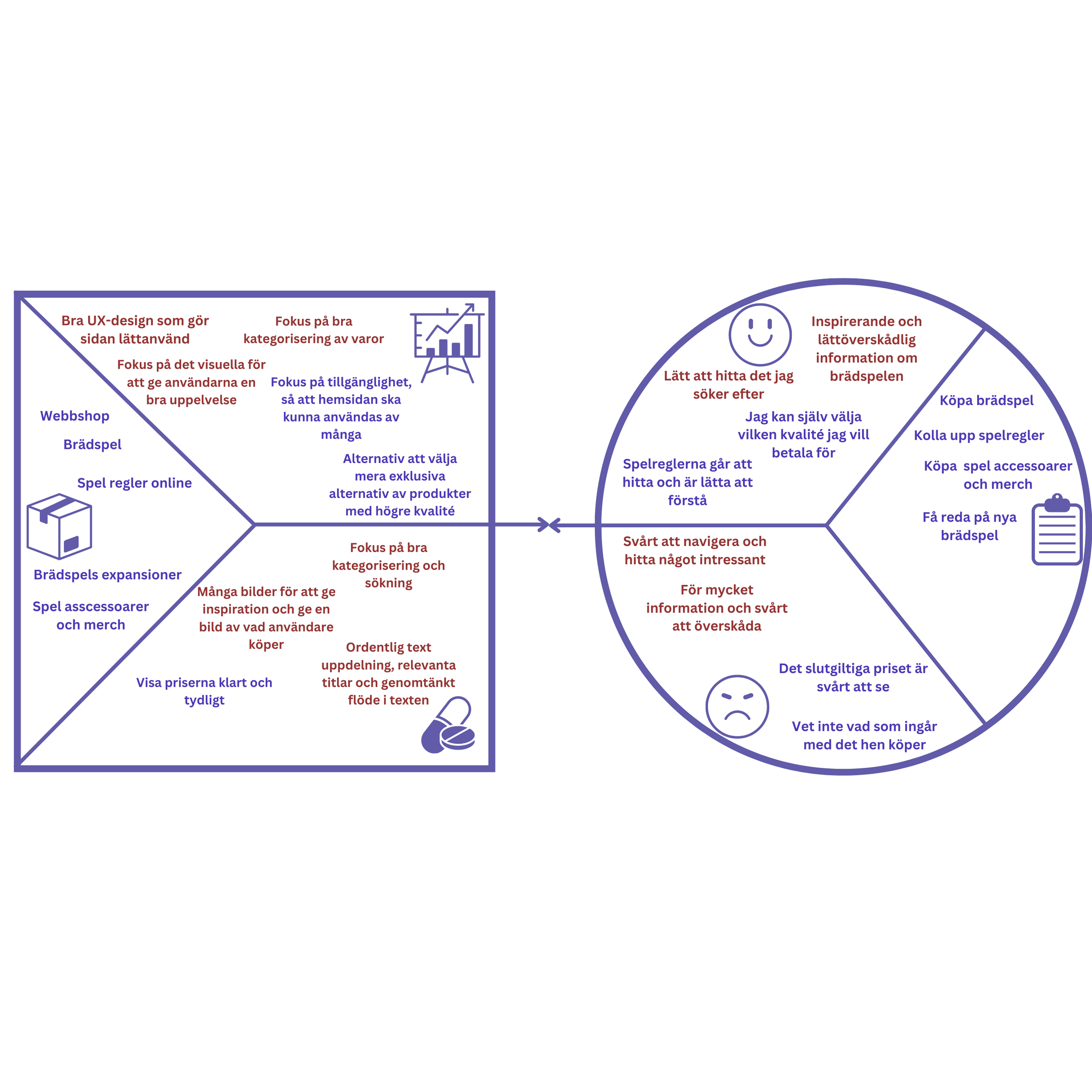
Value Proposition Canvas
I used a value proposition map to highlight the main problems and how to solve them, alongside what users can gain from the website and its essential functions. After some research and thought, I figured out that a confusing navigation system and too much hard-to-digest information could be some of the major issues.
Flowchart
After identifying some key features and potential problems, I began working on the website's user flow. I did this by making a user flow chart that showed how a user might find and purchase a board game, starting from the homepage and ending with the purchase confirmation.
Ideate
Sitemap
User story map
Sketches
Sitemap
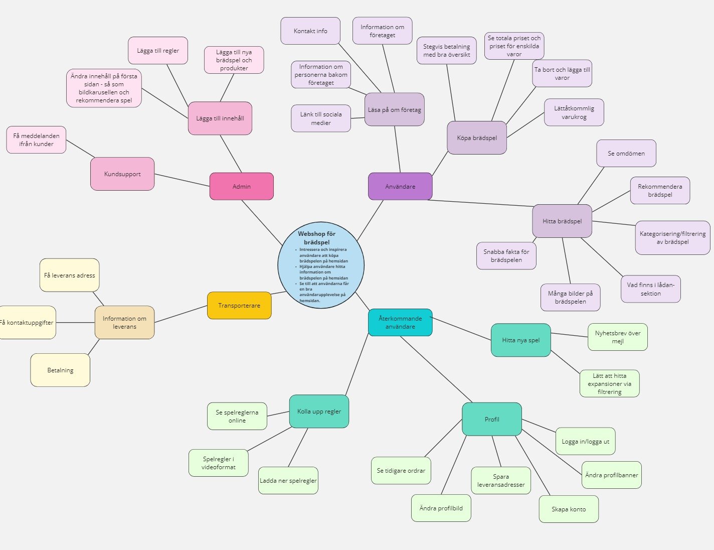
By creating a sitemap, I could get a gist of the overview of the different pages and how they were connected.
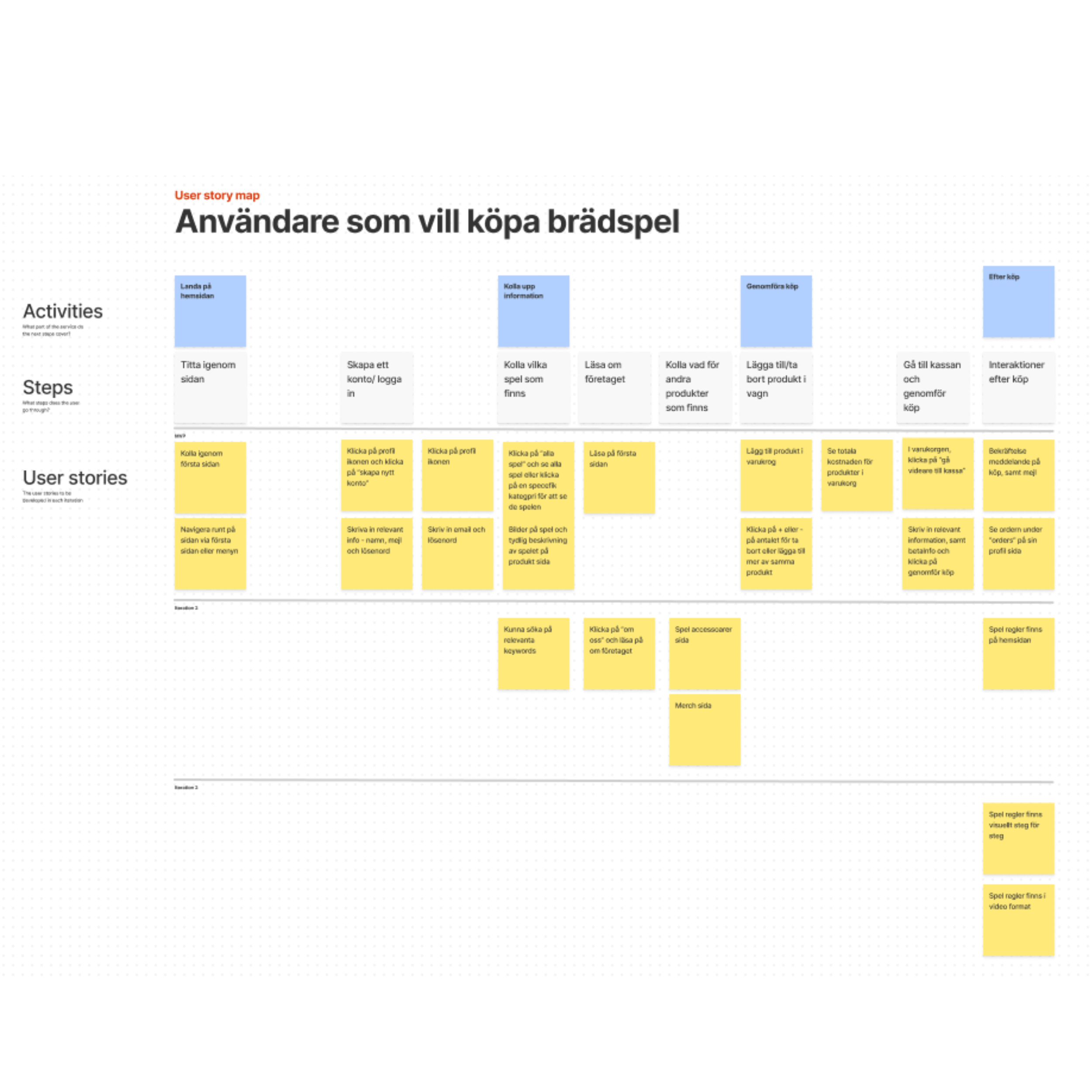
User Story Map
To determine which prototypes to prioritize and which features to include in the MVP - Minimum Viable Product, I created a user story map.
Sketches
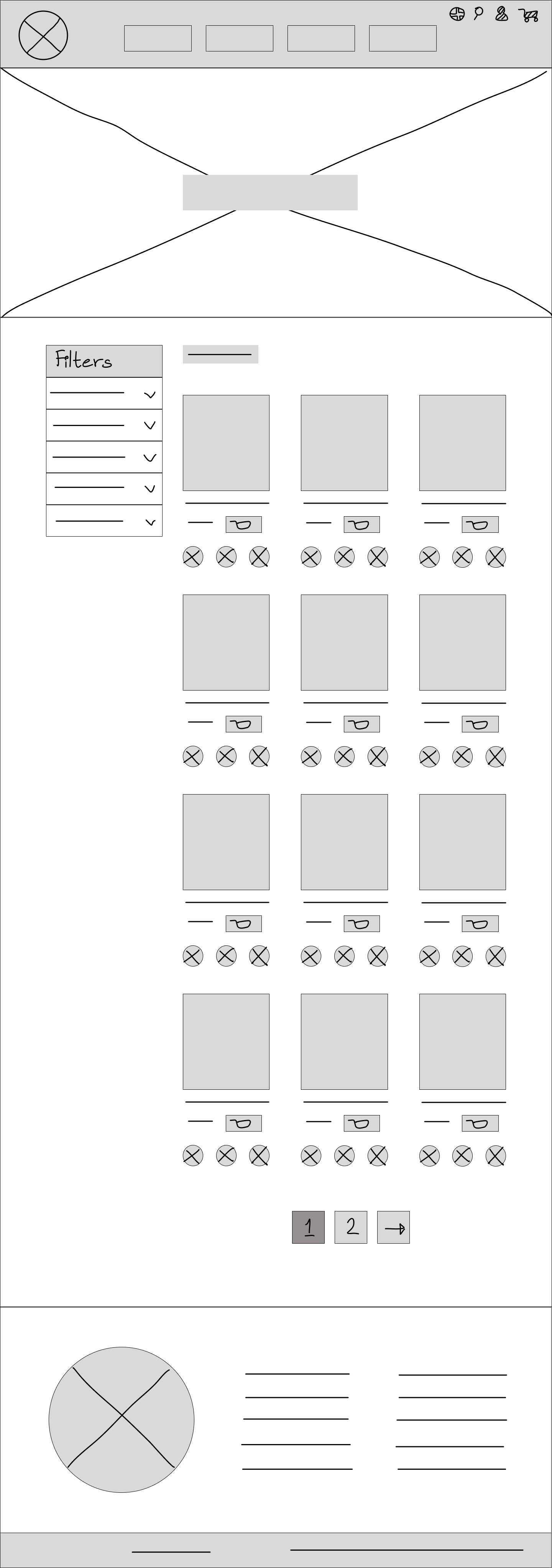
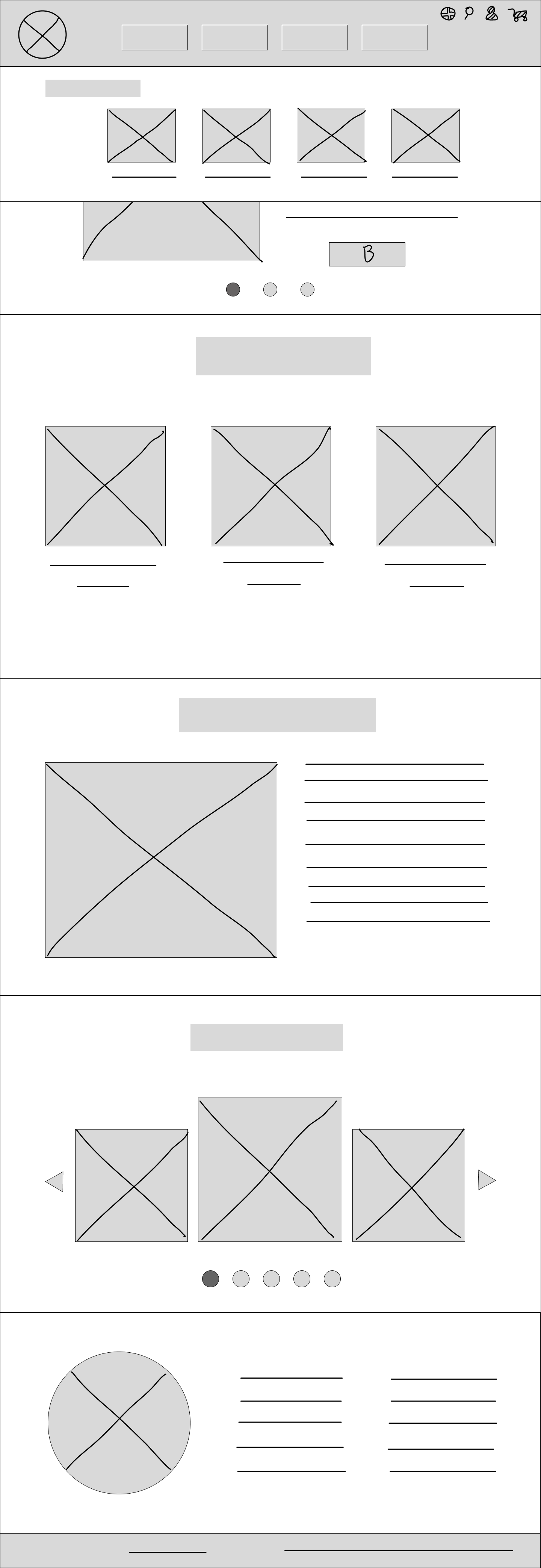
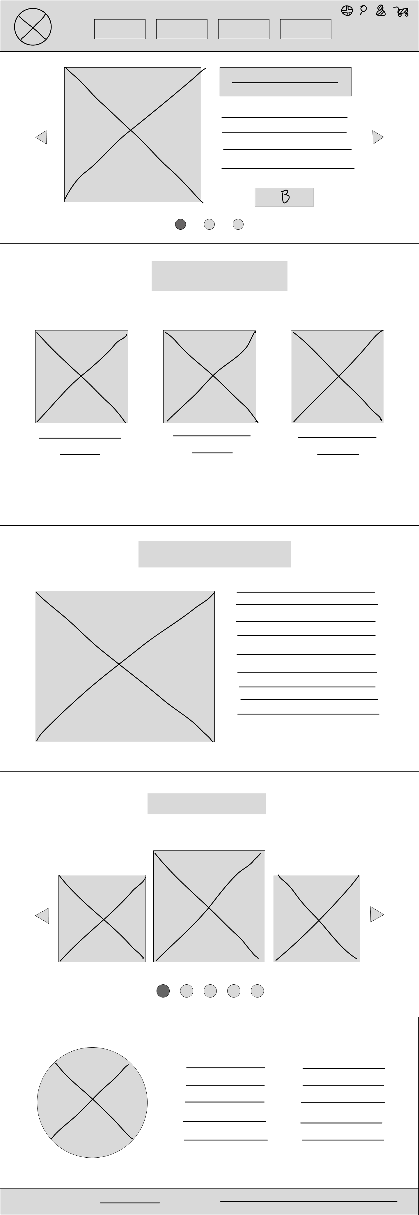
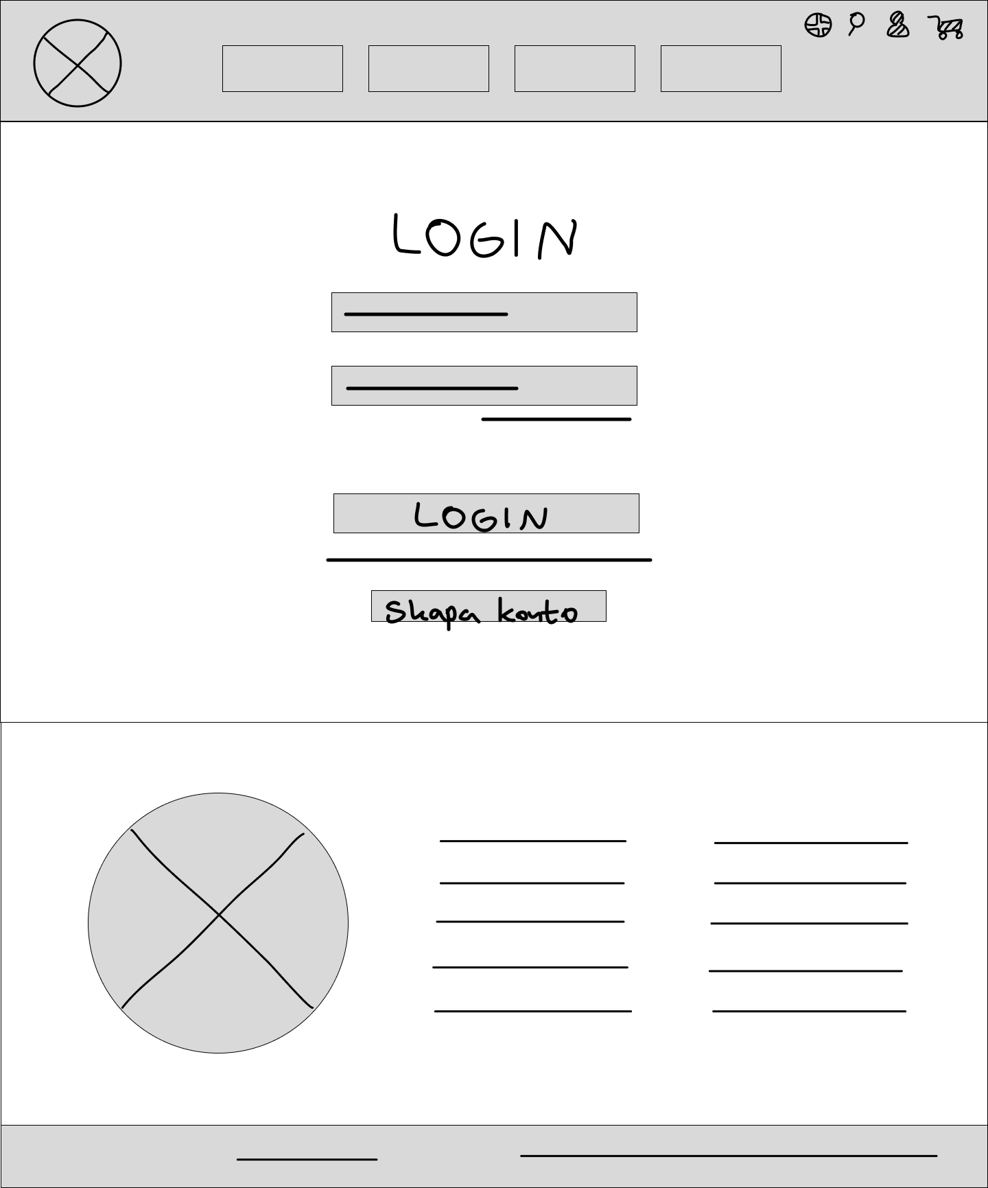
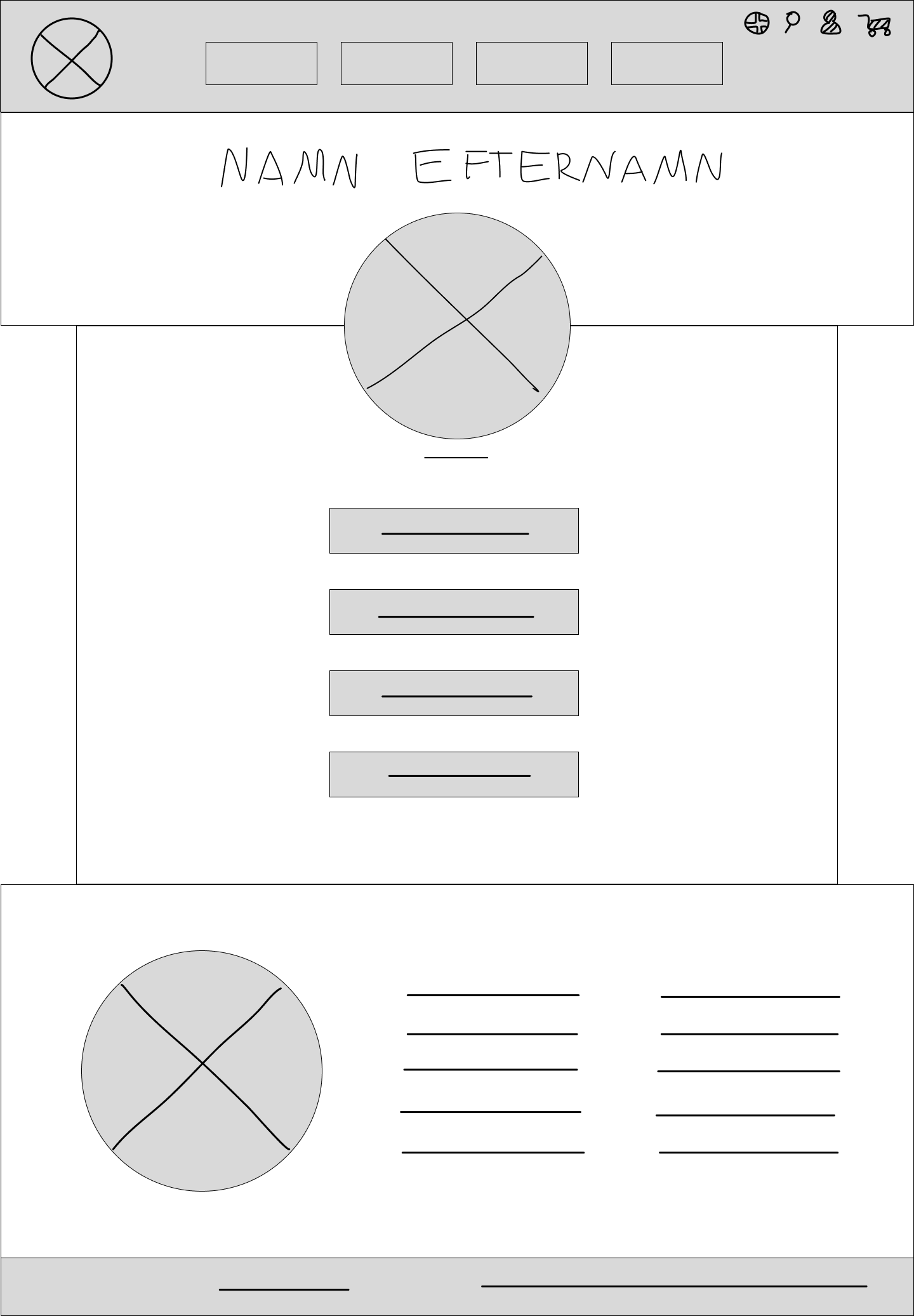
Before I opened figma and started making any substantial prototypes, I opened my drawing software and made some sketches of what I had in mind for the website design. Since these were the first sketches, the final prototypes ended up looking quite different - but it helped me get started.
Prototypes
Low-fidelity Prototypes
High-fidelity Prototypes
Low-fi prototypes
Here’s the low-fi prototypes for here main pages that also shows some of the navigation process.
Board games
Board game details sides
Home screen with menu
Home screen
Purchase process
Purchase process
Mid-fi Prototypes
High-fi Prototypes - Desktop
Home page
Board game catalog
About us Page
Product detail page
Rules Page
Rules Page
User testing
Early tests on Low-fi prototypes
User testing on Mid-fi prototypes
Testing low-fi
Early in the prototype process, I conducted a user testing - specifically to see if the navigation system and the overall layout was intuitiv and user friendly. This was supposed to prevent any need for big changes later on in the design process.
Testing mid-fi
The second round of user testing was made on the mid-fi prototypes. The testers were given specific tasks to do on the website and asked to navigate to certain pages, and then asked followup questions. This test was made both to see if the navigation and user interface was intuitiv and user friendly, but also get insight on the overall feel and thoughts about the website and design in general.
Insights
Navigation is smooth and functions as anticipated.
Creating a user account: The design choice to make buttons grey when inactive is appreciated.
Game details page: The "What's in the Box" could use some work. It seems out of place.
Adding a visual indicator to the shopping cart when items are added would enhance user experience.
The payment process is clearly laid out, making it easy to understand where to click and what actions to take.
The images on the site lack inspiration and are overly repetitive, diminishing visual appeal.
Text sizing across the site is inconsistent, which impacts readability.
On the review page, repeating the address is unnecessary if the billing and shipping addresses are the same.
The buttons on the purchase confirmation page seem placed too low, affecting usability.
The overall design feels flat and lacks engagement, making the browsing experience somewhat dull.
The footer's design is uninspiring and could benefit from a more dynamic approach.
The information provided on the board game cards is useful and appreciated, offering a positive aspect of the site's content.


